Do you ever experience the scenario where you wear a certain shirt and your whole face seems to glow? No, there’s no magic involved—it’s color harmony.
Just three months ago, I got the whole thing about my pricey coral top making me look tired and the $15 dusty pink tee from Target, which made the people around me think that I had a facial, opposite the way I got the whole thing. Up to the very day I realized that I was always fighting against my natural coloring.
The soft summer color palette was a revelation. Bye-bye to guessing games in dressing rooms or clothes that looked great on the hanger but awful on me that would result in buyer’s remorse. Just to clarify, I have colors that work with my features and not against them.
If you are overwhelmed by bright colors and are not quite sure which shades fit you, you are most likely a soft summer too. I will guide you through different steps of identifying your coloring and then creating a wardrobe that truly empowers you.
Understanding the Soft Summer Palette
Soft summer is positioned between True Summer and Soft Autumn in the seasonal color spectrum. It is like a foggy morning by the sea—cool, muted, and understated elegance.
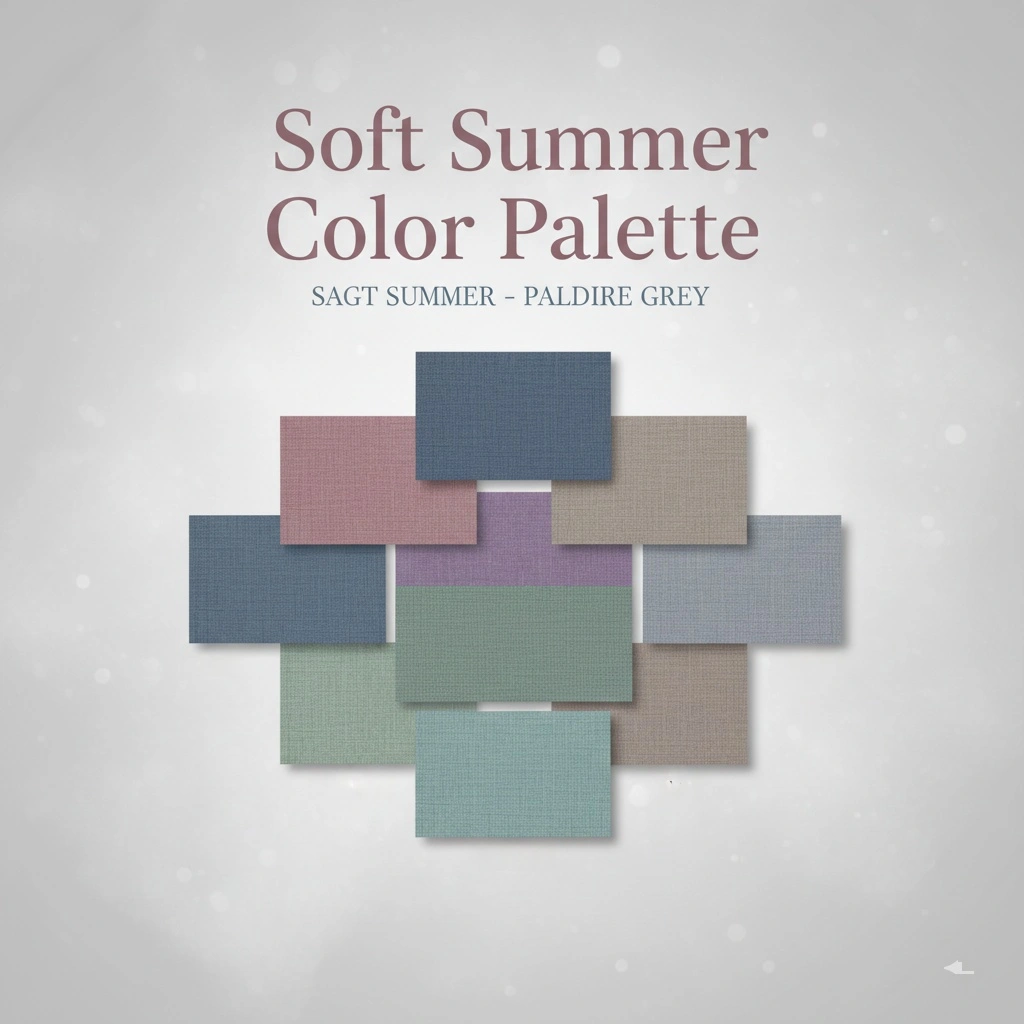
Your colors convey a dreamy quality wherein nothing looks to be harsh or bright. The palette mainly consists of colors that are grey-based and blue-toned, with emphasis on pinks, purples, blues, and greens that are all desaturated and low-contrast. Everything has been made softer, like looking through a soft filter.
What is it that sets soft summer apart from others? You are mainly muted with cool undertones. Not the icy cool of winter, but the neutral-cool with just the right amount of softness to give that harmonious blended appearance. The features do not compete—they are in perfect harmony.
The difference between you and the other seasons is subtle but very significant. The colors of Bright Spring? Too strong. True Winter shades? Way too sharp. Soft Autumn colors? They are close but tend to be warm while you need the cool undertone, so it is not your garden. Your sweet spot is exactly in the middle—cool enough not to get warm, muted enough not to be bright.
How to Know You’re Actually Soft Summer
Take a mirror and place it beside the window where there is natural light. No makeup, only you.
First, look at your eyes. They are likely greyish-blue, greyish-green, greyish-hazel, or tender brown. Anything striking? There is a touch of grey which is giving them a smoky, muted nature instead of being clear and bright. My eyes are this odd grey-green that has puzzled me for years until I got to know the color analysis thing.
Your complexion has neutral to cool undertones. Not peachy or golden—more like porcelain-pink or cool beige. Silver jewelry is more flattering on you than gold, but rose gold works well too. When I switched from gold to silver accessories, friends thought that I had changed my skincare routine. Nope, just wearing the right metal for my undertones.
Hair is the detail that tells the truth. Ashy blonde, light ash brown, medium ash brown—always with a cool, slightly greyish tint. No warm highlights, no warm auburn. Many soft summers had blonde hair as kids that naturally darkened over time. That was me to the letter.
The real giveaway? Low to medium contrast between all three features. Everything blends together in a very harmonious way. You do not have dark-black hair with porcelain skin or platinum blonde hair with dark eyes. Rather, you are beautifully balanced.
Your Best Colors Explained
Think watercolors instead of permanent markers. That’s your whole color palette.
The blues are the most significant color group in your palette, starting from powder blue to slate and soft navy. Not the bright cobalt or electric blue, but rather the calming softer versions. My dusty blue cardigan is practically my everyday wear as it fits every occasion going from Zoom calls to coffee runs.
Shades of green have a major requirement – the greyish one. Sage, seafoam, dusty teal, soft olive. Do not use lime green and kelly green under any circumstances. The yellows and greens commonly show up with a greenish, dirty pastel quality as if very weak light is coming through fog. This may sound weird, but it looks great.
Mauves and purples are your hidden artillery. Dusty lavender, heather purple, soft plum, muted lilac. These tones appear elegant but are not very pretentious. I started to wear a mauve lip color as my signature after I found out about this palette.
Muted tones are the only way to go with pinks. Dusty rose, soft raspberry, and muted coral are some of the examples. On the other hand, bubblegum pink and hot pink are definitely not included. It is the vintage roses that have lost some of their color that are the ones to think about, not the fresh ones. That distinction is far more significant than it might seem.
Neutrals take the place of black. The purest of blacks can be rather unflattering to soft summer complexions and can even add to their age appearance. The neareast shades to black you can afford to wear are the dark brownish greys, which, in turn, are softer and quieter. Your “black” really is either charcoal or deep grey-brown. The colors of soft grey, taupe, sand, and mushroom can be used as your neutral base.
Colors That Actively Work Against You
Completely avoid these to save yourself time and money.
Light and vibrant colors take all of your attention. Bright coral, electric blue, hot pink, vivid yellow – these colors are all too strong. The color becomes the one who shows and you are just the one who hides behind. I was taught this lesson when I bought a neon orange sports top that gave me the look of a traffic cone.
Rich and warm colors create a discord with your cool undertones. Orange, yellow, and brown, and even terracotta are some of the hues that fight against your natural complexion. The soft autumn color palette looks great in these tones, but the soft summer palette looks dull and lifeless.
Pure white and Jet black have very high contrasting effects. Off-white, cream, or ivory look better than bright white. Charcoal or deep grey-brown can be used instead of Jet black. The difference might look insignificant, but the impact is huge.
Soft Summer Celebrities to Watch
Jennifer Aniston, Kristen Stewart, Emily Blunt, and Sarah Jessica Parker all exhibit the soft summer aesthetic through their color choices that never fail.
Take a look at their red carpet moments. The colors they pick are dusty pink, soft grey, muted blue, and gentle mauve. They feel awkward if they are wearing bright or warm colors; the outfit is overpowering rather than supporting.
They are very artists when they are in their palette. Kristen Stewart in light grey and black rose? Ideal. Emily Blunt in light purple? Quite a beauty! Their look is like they are going with the flow of nature because they are using their natural coloring, not fighting it.
Observe what suits them best and incorporate those rules into your closet. The moment you do, you will catch your eye on the patterns of what is best for you.
Building a Wardrobe That Works
As a matter of course, begin with basics of neutral and the best shades you could come up with. The colors you require as well as the foundation are charcoal, soft grey, dusty navy, and taupe. These colors will be the base of everything else and will work well together.
Then, there will be the gradual introduction of the accent colors. The addition of the dusty rose cardigans, soft teal blouses, lavender sweaters, and sage green tees gives the wardrobe more character but at the same time, it is still in line with the coloring. One by one, I got rid of my brightly colored basics during the course of six months. The result is that now my whole wardrobe is inter-related.
With regard to the patterns, you can go for watercolor prints, delicate florals, subtle textures, and soft plaids. The colors of soft summer are monochromatic, and the combinations of similar values are the most flattering. Do not go for bold geometric patterns or high-contrast prints—they will overpower your softness.
Denim is the fabric that you should always have, especially the faded or grey-toned washes. You would better avoid the bright blue or dark indigo ones and opt for soft, worn-in looking shades instead. My favorite jeans have the perfect dusty blue color that matches all the colors in my palette.
Feel free to mix your colors. Dusty plum with slate grey? Stunning. Soft teal with charcoal? Classic. Sage green with taupe? Chic without effort. The beauty of having your palette is that all the picks go together in a very natural way.
Makeup That Enhances Your Features
The foundation shade should correspond with your cool-neutral undertones. Seek descriptions such as “porcelain,” “cool beige,” “rosy,” or “neutral.” Steer clear of shades that are marked “warm,” “golden,” “honey,” or “sand.”
Soft rose, mauve pink, dusty berry, or muted raspberry lip colors look natural and come with a polished aspect. My dusty rose lip color is almost a part of my daily routine—it gives a fresh look to my face while not being over the top or looking as if I’m trying hard. Berry colors are nice for night time.
Eyeshadow shades of taupe, soft grey, dusty rose, and muted purple provide a range of looks that are both wearable and flattering. Just mix them up for different depth without the fuss. The taupe and grey mix is super convenient—the range of occasions goes all the way from grocery shopping to dinners out.
Blush colors should be soft pink, dusty rose, or muted mauve. In other words, nothing too bright or peachy. The aim is to have a soft color that makes you look like you’re naturally glowing and not like you’ve just put on makeup.
Soft brown, grey, or muted plum eyeliner looks much better than harsh black. Brown-black or soft black mascara seem less severe than true black.
Hair Color Strategies
Your natural hair color, in the majority of cases, is the best choice for you. The ash tones, indeed, match your soft summer coloring very well.
If you are coloring your hair stay within the limits of ash blonde, cool brown and soft espresso. Do not use colors that are too dark, too light or too brilliant as they will take away the softness of the summer looks. The idea is to subtly enhance and not to make a dramatic change.
When it comes to highlights, go for ash blonde or cool beige balayage. No gold or brassy—such warm tones won’t go with your cool undertones. I once experimented with caramel highlights hoping they would give me sun-kissed effect. They simply looked wrong. Changed to ash blonde highlights and all of a sudden everything was in tune.
If you are going grey naturally, do not hide it. Grey hair on soft summers is stunning because it is in perfect harmony with the overall aesthetic of the soft and cool colors.
Mistakes to Avoid
The biggest blunder? Following trends that are not compatible with your natural coloring. If neon is trendy but you happen to be a soft summer, then don’t go near it. The soft, cool tones are the elegance of your moment that is never out of style.
Don’t think that “soft” means unexciting. The palette you possess is deep and varied with amazing flavors. Mix dusty plum with slate grey, soft teal with charcoal, sage with taupe. You will make nice and interesting looks without giving up on your standard of beauty.
Stop mixing Soft Summer up with Soft Autumn. They are both muted, yes. But Soft Autumn is warm while you are cool. If you are attracted to warm browns and oranges, then check your undertones once more. That coolness separating soft summer shows up every time.
Don’t buy clothes one piece at a time. That stunning dusty rose dress might fit into your palette just perfectly, but if you don’t have anything to layer it with, you won’t wear it. Gradually build up your wardrobe with neutral basics around that.
Making It Practical
Knowing your soft summer color palette makes shopping unbelievably easy. I have color swatches stored on my mobile phone, which is simply a screenshot of my palette. I check my comparison before anything gets bought. It has helped me a lot in avoiding impulse purchases.
For office use, soft navy blazers, dusty rose blouses, and charcoal pants have such a wonderful and professional look to them without the harshness of black. To finish the look, you can add soft grey or mauve accessories. You will be noticed for all the right reasons—a person who is polished and well-dressed.
Weekend style is the same and works perfectly. Worn-out jeans, fruity pink sweatshirts, soft sage-colored T-shirts, and grey jogging pants. The casual garments from your color palette are as blended together as your formal ones. Everything falls into place effortlessly.
Travel packing is no longer a stress. Pick four neutral shades from your palette, add three brighter colors, and everything can be mixed and matched. I was able to take only one carry-on for my weeklong trip because all my clothes matched perfectly.
Your Next Steps
The knowledge of your soft summer color palette completely changes your style perception. You don’t go for the trendy or the ones that look good on someone else; instead, you pick colors that make your natural beauty shine.
If this seems to be a lot, then start off by doing the small things. Get a soft summer equivalent for one bright or warm piece and get rid of the other. Dusty rose can be used instead of hot pink. Soft grey can be used instead of bright white. Observe how the difference in your looks and feelings.
Your muted, cool coloring isn’t a problem that you have to fight against, it’s a way to work with. Those colors, which could be perceived as bland on other people, make you glow. That’s the power of knowing your palette.
Following the soft summer color palette is not about strict rules. It is all about recognizing the shades that naturally enhance your features instead of overshadowing them. Once you get that, dressing up is no longer a hassle.